- Restaurant apps have come along way since Starbucks began testing mobile payment in 2009.
- Today, ordering food through an app has become ubiquitous. But, some chains offer clunky apps.
- Insider reviewed the apps of the top 10 chains in the US to see which one was best.
One of the most significant innovations to hit the restaurants in the nearly two decades I’ve been covering the industry was the introduction of the mobile app. The movement was led by digital pioneers such as Starbucks, Chipotle, Taco Bell, and Panera Bread.
Today, ordering food through an app is ubiquitous. It’s the most convenient way to interact with a brand. We can order food, earn rewards, and find unique online-only offers.
But some fast food apps feel like they’re living in the dark ages. Some are slow, clunky, and hard to navigate.
Starbucks is certainly the gold standard of apps. But is it the best? Here’s how I ranked the apps of the biggest restaurant chains in the US.
10. McDonald’s
After lagging behind rivals for years, the chain’s app now has over 57 million active members. And digital sales make up a large portion of overall sales.
But there’s a reason why the number is so high. Unlike other chains, you can’t order without being forced to “sign up” for the app. There’s no such thing as guest ordering. It’s a digital bully.
If you accidentally log out of the app, it’s not easy to log back in if you forget which email you used to register. It takes about 3-4 steps to get back in the app.
Once you finally get logged into the app, it is very promotional. It’s peppered with the latest marketing ploys. I don’t want advertising in my face.
When I’m ordering food, I want a convenient, fast, and frictionless experience on the app. McDonald’s does not offer that.
9. Subway
Subway pioneered the walk-along ordering format copied by others such as Chipotle, Sweetgreen, and Cava. The chain grew into the largest fast-food brand in the world by offering customers a custom build-your-own sub.
But the app doesn’t offer that same personalized experience.
The app is broken down into categories of pre-set sandwiches, including the new Subway Series, Classic Sandwiches, and Wraps. Once you pick a signature sandwich, customers are then allowed to remove and add ingredients to the sandwich.
But it’s not the same as customizing a sandwich from scratch.
It wasn’t always like this. When Subway began testing mobile ordering in 2014, customers were allowed to design their own sandwich and watch it “visually” change as they selected ingredients, according to Nation’s Restaurant News.
8. Chick-fil-A
I expect more from Chick-fil-A. The chain is one of the most successful franchises in fast food, but they don’t seem to be putting any thought into their app.
There are too many drop-down menu tiers for making food selections. Also, they have a picture of every ingredient, which triggers a lot of scrolling. Those pictures take up a lot of space. I think most customers know what tomatoes and pickles look like.
Why not have a simple list of ingredients? Also, because the pictures take up so much space, the chain uses a very small point size for the text. It’s hard to see text like the upcharges the company charges for adding items like cheese or tomato to a sandwich. Yes, adding tomato costs 20 cents extra on a classic chicken sandwich. Adding lettuce will also cost you an additional 20 cents.
Still, the app, which debuted in 2012, is popular. The loyalty arm of the app has 50 million members.
7. Dunkin’
Dunkin’ has a big menu, which could make its app unwieldy. However, the digital menu is categorized logically, making it easy to find beverages and doughnuts. Unlike McDonald’s, you don’t have to jump through hoops to register. I was able to register quickly by signing in using my Apple ID.
One thing that makes the app stand out is that it offers nutritional information underneath each product description. That feature has been around since Dunkin’s mobile app first launched in August 2012. Today, its 8 million loyalty members are offered frequent deals through the app.
It’s a relatively easy app to use. I like how it shows featured items at the top, such as fall specials. It also allows you to order ahead, even a day ahead.
But, the app is really behind the times because it doesn’t give customers an option for delivery. That’s a big miscue for any brand looking to keep customers coming to their app. The last thing you want to do is send customers away to third-party delivery apps, where the margins are slimmer due to high marketplace fees.
6. Taco Bell
When Taco Bell introduced mobile ordering and payment in 2014, chain president Brian Niccol, now the CEO of Chipotle, called it “the biggest innovation since the drive-thru.”
I believe that’s true. But Taco Bell’s app looked terrible for years. It was clunky and hard to navigate and didn’t offer delivery until 2022.
Today, it looks like a knock-off of Chipotle with customization tools. But, it’s not as seamless an experience as Chipotle.
Still, the app has some pros: The menu images are enticing, albeit a bit too big and in-your-face. I like that you can schedule meals for pickup at a certain time. That’s an innovation Panera Bread, the nation’s 11th largest chain, became known for years ago. Now, other chains are following suit.
5. Wendy’s
Like Dunkin’, the Wendy’s app was relatively simple to join using my Apple ID. I was welcomed with eight offers, including $4 off a delivery order of $20 or more.
Like Chick-fil-A, Wendy’s likes to show pictures of every single ingredient, from tomatoes to cheese slices – only the photos are much bigger. Certain items like sweet onions and pickles will give you options to select portion sizes such as “lite,” “regular,” or “extra.”
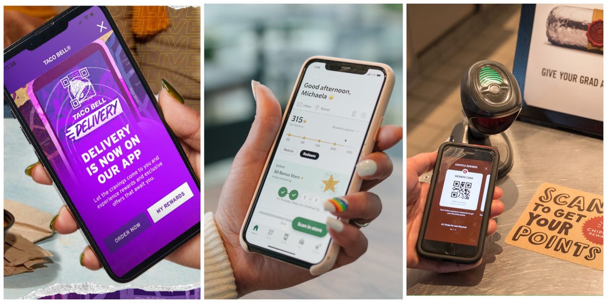
Like Starbucks and Chipotle, there’s a QR code to scan for in-store purchases, allowing customers to earn reward points.
4. Burger King
I was pleasantly surprised by the sleek design of the Burger King app. The retro branding matched the in-store experience. Navigating the food menu was also simple.
Most of the apps put combo meals front and center. Sometimes, it’s hard to find a la carte options. But at Burger King, you start with an a la carte burger or chicken sandwich and build your meal from there. I like the simplicity of that.
The chain is the only one that I encountered that asked if I needed utensils. “Help us avoid plastic waste, include utensils only if needed,” the app states when you checkout.
They get extra points for helping to save the planet.
3. Domino’s
There’s a reason why Domino’s calls itself a technology company that sells pizzas. It’s been innovating on how to deliver the best and fastest pizza for years. Today, Domino’s generates over 80% of sales through its digital ordering channels.
The app is excellent, although I need my cheater glasses to read the variety of topping and pizza sauce options. But that’s okay. Everything is listed cleanly on the app, making it easy to scroll and make selections.
It’s less noisy than other image-heavy apps.
2. Starbucks
Starbucks is the gold standard of restaurant apps. The chain first began testing mobile ordering in a handful of markets in 2009 before going national in 2011. They’ve been a leader in the mobile app space ever since. About 28% of its US company store transactions are mobile orders, the chain told Insider.
With two or three clicks, I can reorder my favorite drink from my local store. When I’m traveling, the app allows me to find local cafes near my location, so I don’t have to fret over where I need to go to get my morning Joe.
I can customize my order exactly the way I want in the app as if I were in one of the cafes. In fact, I can personalize my order even more because I can take my time reviewing all the options. I can also use the app to make in-store purchases, a seamless way to rack up rewards points. Customers love the app so much they’ve found ways to hack it to get cheaper drinks.
The only reason why it doesn’t make the No. 1 spot is because Starbucks doesn’t allow you to order ahead like Chipotle. You can only order drinks on-demand.
1. Chipotle
Though Chipotle released its first app in 2009, the brand’s digital ordering channel didn’t take off until Brian Niccol became CEO in 2018. The chain took a “maniacal” approach to modernizing its digital platforms to make the brand more accessible to consumers—the chain’s investment in the app paid off.
At the time, digital sales represented 8.8% of total sales at Chipotle. Today, digital sales represent 36.6% of the chain’s total food and beverage sales. In 2019, the company launched its rewards program, which now has 36 million members.
It is, by far, the most seamless and easy to navigate among the apps of the top 10 chains. The app is a digital replica of the in-restaurant experience. I literally feel like I’m walking along the line, customizing my meal with easy swipe left, swipe right movements on the app. In fact, I would argue that customers get a more personalized experience than the in-store experience. For example, the Chipotle app gives you uber-specific portion size choices such as “normal,” “extra” or “light’ servings.
The chain also offers exclusive meals that can’t be ordered in-store, like the quesadilla and Lifestyle bowls. And you can schedule your meal for pickup whenever you want. Another big pro: Chipotle will tell you the progress of your order, so you know exactly when the order is ready.
Not surprisingly, the executive in charge of Chipotle’s app development, Curt Garner, used to work at Starbucks when the company pioneered its app.
Read the full article here


