- Everyone is freaking out about the new Slack update.
- It includes lots of new theme colors, including gradient mixes.
- Some colors are nice, but others … are not our favorites.
By now, you’ve probably seen that some — ahem, many — people are kind of pissed about the new Slack update.
Slack, now the go-to messaging app for many offices and workspaces, was initially released in 2013 and has only grown in popularity. The company hosts over 10 million daily users, who use it for everything from meetings to project planning.
A spokesperson for Slack told Insider they understand the update is a “big change” for their customers and that it will take some time to get used to. The company is using a “gradual” rollout strategy to allow them to work in customer feedback.
“Ultimately, the goal for this change is to make it easier to work in Slack, so we’re listening to our users to make sure that’s the experience they’re having,” the spokesperson said in an email.
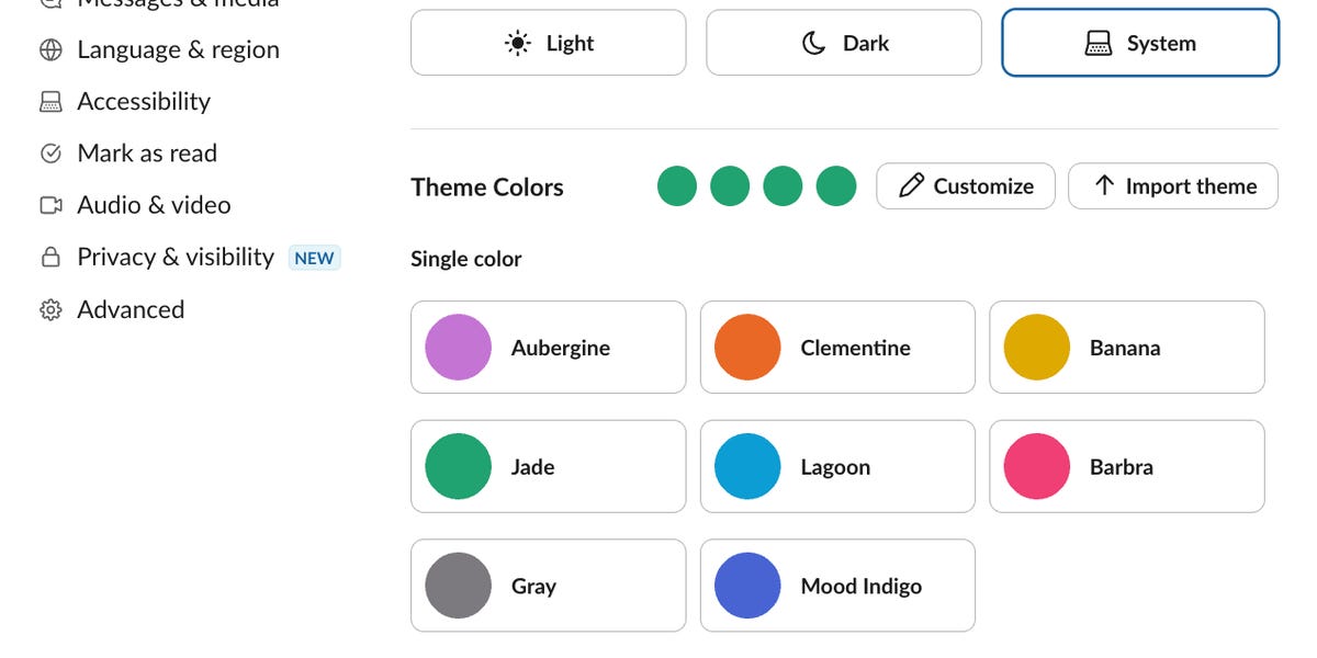
There are a wealth of Slack themes to choose from
Some are “single colors,” which replaced the older options for “clean and minimal” or the ability to create a “custom” color with eight Slack-chosen color options.
Twelve are “fun and new,” which mostly involve two or three colors mixed into a gradient.
Six are “updated classics” — meaning they existed pre-update but are now implemented differently, with gradients on the screen instead of color contrasts between the background and selected chat color, for example. Our ranking has also included these because their “look” has changed substantially.
(There’s also a “surprise me” button that picks a random theme for you, which I definitely had some fun with.)
Although some of the new theme colors aren’t so bad — I, myself, am partial to the “Jade” scheme — unfortunately, a lot of them are. It’s possible the number of brown and yellow-green-centered themes are the equivalent of Harry Styles shaving his head this week — catastrophic.
In what will arguably be the most pressing and influential story of the week, I created a definitive ranking of the worst Slack theme colors, listed from passably usable to downright criminal.
Only one caveat: I’m leaving out the vision-assisting color settings, of course, because I’m not a monster, just a journalist.
Starting with the passably good: Lagoon
Type: Single color
It’s pretty, it’s calm, it’s all good. We’re not talking anything special here. I have no particular beef with this setting.
Banana starts to go a little bit south for me
Type: Single color
Okay, fine, so maybe I’m just not a big fan of the yellow.
What did you think you were reading, a scientific paper? I never promised to be free of preexisting bias.
In the middle of the list, we have the true neutral option: gray
Type: Single color
This theme means nothing. This is like picking a Toyota Echo as a car. It drives. You probably don’t have anything bad to say about it, but there’s nothing good to say about it, either.
Big Business is, in fact, not the business
Type: Fun and new
This looks like Computer Science majors would use it just because it’s called Big Business, and they’re manifesting or whatever.
Whoever made this said, “Let me take ‘Lagoon’ and just make it worse.” 3/10.
Lemon Lime is also, objectively, not the move
Type: Fun and new
Ah, yes, the classic and timeless pairing of old-cheese yellow and neon green. Leave this pairing to sun-bleached Sprite cans, please.
Before the final boss, as it were, of bad Slack theme colors, my honorable mention for the worst theme.
In almost-loser place is ‘Banana,’ but in dark mode
Type: Single color
I just hate it. I really don’t have much else to say. Insert whatever low-hanging poop-color joke you’d like to, reader.
Finally, here we are, folks. The worst Slack theme color is… (drumroll please…)
Haberdashery is, ultimately, the resounding loser of this ranking
Type: Updated classic
The main sin of this theme is that it just seems like false advertising, frankly. The above photo is the theme implemented, but its preview looks like the below photo in settings.
What the hell? This is the Judas in my 12 evil apostles of Slack. Promised pink, yellow, and blue, and given dark blue and burnt yellow-brown?
I also just hate that they named it “Haberdashery,” but I’m man enough to admit that that isn’t a fair aesthetic ranking.
However, I do imagine that after making this, the creator thought, “Now I am become death, destroyer of worlds.”
As an ending note to the genuinely kind employees of Slack, I apologize. I enjoyed talking with you and felt guilty about my impending evil ranking. Know it’s nothing personal — I’m just an asshole who loves a well-coordinated color palette.
Read the full article here


