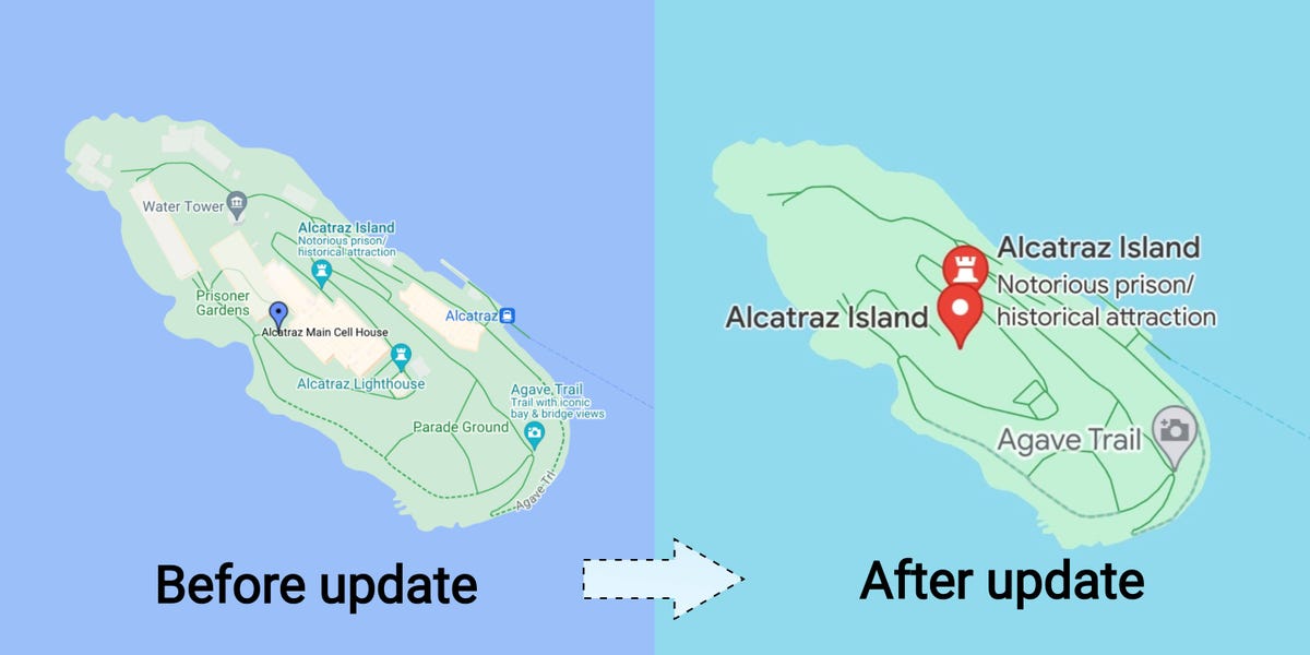
Google Maps, the tech giant’s GPS app, has a new look that’s drawing the ire of some users — including a former Google designer who said she worked on the app in its early days.
Last week, Google announced in a blog post it had issued updates to its Maps app. The updates, which the company said would roll out to iOS and Android users in the coming weeks, include public-transit directions with more detail, locations for electric-vehicle-charging stations, and a feature that allows friends to share their favorite places, to name a few.
But one Maps upgrade is causing public uproar across social media — its new color scheme. After the Google Maps facelift, roads are now gray, water has changed from a darker to a lighter blue reminiscent of a clear sky, and parks and other public spaces are now a lighter shade of green.
15 years ago, I helped design Google Maps.
I still use it everyday.
Last week, the team dramatically changed the map’s visual design.
I don’t love it.
It feels colder, less accurate and less human.
But more importantly, they missed a key opportunity to… pic.twitter.com/HMcpKiOEdr
— Elizabeth Laraki (@elizlaraki) November 22, 2023
Elizabeth Laraki, who said she was one of two designers behind Google Maps in 2007 and was still using it every day, posted her gripes with the app’s new visual design on X, formerly known as Twitter.
Laraki said the colors of water and parks “blend together” and that the app’s color palette looks more “computer generated.”
“I don’t love it,” the ex-Google Maps designer wrote on X regarding the design update. “It feels colder, less accurate and less human.”
Other Google Maps users echoed Laraki’s critiques about the app’s new colors.
“I’m definitely late to the party but this new Google Maps color scheme SUCKS ASS,” Sasha Luccioni, an AI researcher at Hugging Face, an AI startup, wrote on X.
I’m definitely late to the party but this new Google Maps color scheme SUCKS ASS.
— Sasha Luccioni, PhD 💻🌎🦋✨🤗 (@SashaMTL) November 23, 2023
“Why has Google maps all of a sudden changed the colors?” one X user who says they’re a product-management expert wrote. “Has the water really turned turquoise from blue?”
Some Google Maps users said they didn’t even recognize the app anymore.
“I thought i was looking at the wrong app the first time i opened it after the switch,” Paris Marx, a tech commentator, wrote on X regarding Maps.
Still, longtime Maps users aren’t dunking on every new design feature. Laraki said major roads, traffic, and trails stood out more — an update she said she believed was part of Google’s goal to make Maps’ easier to use.
One Maps user wrote on Reddit that they actually liked its new colors because they offered greater contrast that’s “a bit more pleasing to the eye.”
Despite the changes, Laraki said she believed Google “missed a big opportunity” in terms of simplifying the design of Maps.
“Google Maps should have cleaned up the crud overlaying the map,” Laraki wrote in reference to features such as the placement of the search box and satellite and traffic overlays.
John Gruber, a tech blogger, responded to Laraki’s X thread with his own thoughts on Google Maps’ new design.
“This is a very long way of saying that Google Maps’s app design should be like Apple Maps,” Gruber wrote in a blog post.
In other words, Google Maps users may’ve switched to Apple Maps for a good reason.
Google and Laraki didn’t immediately respond to a request for comment from Business Insider before publication.
Read the full article here


