As I write this, we’re only a few hours removed from Apple’s “Scary Fast” event during which the company introduced the next generation of Apple silicon in the M3 family of chips, as well as updated MacBook Pros and an updated iMac with which to run them. The company touted its newest Mac processors by echoing the event’s tagline in describing them as “scary fast”—but those adjectives are just as apt in describing the pace of the online show itself. It came and went in a half-hour; at 30 minutes, it was easily the shortest event I’ve ever covered—from the comfort of my couch this time—in a decade of chronicling Apple at close range.
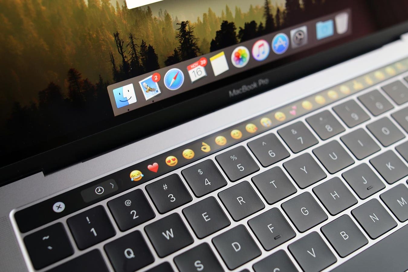
While there are refreshed MacBook Pros and a refreshed iMac—the space black finish on the former looks stunning, while the latter has left me wondering if it’s time for the Intel-powered 21.5” Retina 4K iMac (upon which I’m writing these very words) to give up the ghost after nearly 5 years—the model I’m most intrigued by tonight is the departure of the 13-inch M2 MacBook Pro. A cursory glance at Apple’s store nets you the knowledge that the 14- and 16-inch MacBook Pros, in all their M3 glory, are the only pro laptops in town. Of particular interest is the 13-inch model was the last to be festooned with the Touch Bar.
I watched the event with the expectation Apple would upgrade the 13-inch Pro to the M3; they did not. It’s dead. The jubilation over Apple putting the final nail in the Touch Bar’s coffin was palpable on X/Twitter, with a significant portion of the posts I saw scroll past offer the same excitement about the news as when Dorothy melted the Wicked Witch of the West. As my friend Zac Hall noted, the Touch Bar now is officially relegated to the ash heap of Mac history. When it seemed readily apparent the 13-inch Pro wasn’t getting upgraded, I couldn’t help but feel somewhat dejected. Although I received a 13-inch M2 Air as a late Christmas gift back in January, and love it, a part of me always yearns for the Touch Bar. For me, it was genuinely useful.
With the Touch Bar, most in the Apple community and the tech press either hate it with the passion of a thousand suns or are apathetic towards it. The truth is, however, two things have always been true about the Touch Bar: It needed iteration it tragically never saw and, for many, it was a great tool for making macOS a more accessible platform.
Much of the derision from the Touch Bar doomsayers since its 2016 debut has been about Apple’s high-res OLED strip becoming something which replaced the Function keys and was something you (naturally) had to look down at in order to use. It was a screen, after all. In one sense, that logic is perfectly valid. The problem with it, though, is it relies on the premise that everyone who uses a laptop is a touch typist. Buy the premise, buy the bit. What this fails to take into account for, predictably so, is the fact not everyone is able to touch type. As ever, accessibility use cases are overlooked because the majority of people are able-bodied.
Someone get me to a chair… I think I may faint.
The reality is, touch typing is a skill not everyone has the visual and motor skills to count on. I know I don’t. Every word I’ve ever written for this column has been accomplished by some learned combination of looking up and down from screen to keyboard, all the while typing only using my pointer fingers. I’m looking down at my keyboard out of necessity because I can’t rely on my shoddy hand-eye coordination. Ergo, the Touch Bar would theoretically always be in my line of sight and right there for me to quickly tap. That isn’t an insignificant matter.
The Touch Bar is useful still from an accessibility point of view when considering it effectively acts as a hardware version of Shortcuts, what with its one-touch access to common actions like sending an email, picking emojis, switching Safari tabs, and much more. In a similar vein to touch typing, keyboard shortcuts aren’t always accessible depending upon one’s level of dexterity. Even with the presence of an accessibility feature like Sticky Keys, the Touch Bar makes common operations much more streamlined. What’s more, the Touch Bar’s strong visual resemblance to iOS—the Touch Bar’s software component is actually a spork of watchOS—means there’s a lot of comfort and familiarity with, for instance, the straight-outta-iOS emojis from which to choose. In terms of cognition, the Touch Bar’s cross-platform consistency can mean a lot for someone with certain cognitive conditions by alleviating load.
I will, and do, concede the Touch Bar had problems. It needed further innovation like haptic feedback. My understanding, according to sources I’ve spoken to over the years, is Apple more or less fell out of love with the Touch Bar pretty quickly. Apple pundits like to call the latter part of the last decade a sort of Dark Age for Mac laptops, often indicting the company’s strategies during that period by pointing to the Touch Bar. It’d be a real page-turner if somebody at Apple left Cupertino to write a tell-all book about Mac development during this era; like 3D Touch, the Touch Bar came into the world with a bang and left with but a whimper.
Speculation notwithstanding, it’s my strong opinion that dancing on the Touch Bar’s freshly-dug grave is more than a little disingenuous. It’s one thing not to like it, and I also know many in the disability community who’ve said as much over the years, but to say it was an abject failure or complete gimmick is reveling in one’s own ableism. To grouse and mourn the loss of the Function row is fair. To unilaterally presume the Touch Bar is useless ostensibly because nobody looks down at the keys shows an awfully narrow view of how people actually use technology.
As for tonight’s new MacBook Pros? My review of the M2 variety earlier this year remains solid, although I again admit to lusting over space black. As for the Touch Bar? “Good night sweet prince,” indeed.
Read the full article here


