Paint is one of the easiest and least expensive ways to revitalize your home. However, it can be difficult to determine which colors are trending – or not – and which are more suitable for certain rooms and areas.
HGTV Home By Sherwin-Williams just released the 2024 Color Collection of the Year, which includes 10 shades. We chose some of our favorites, and asked Ashley Banbury, color marketing manager at HGTV Home by Sherwin-Williams, for tips on how to make these colors work in your home.
How does this collection differ from last year?
“This year’s Color Collection of the Year, Renewed Comfort, is about bringing comfort into the home through the use of color,” Banbury tells us. “The hues feel dependable and familiar – yet versatile, with the ability to be reshuffled to create the personalized look we desire.”
“Home interior trends are leaning to be more minimalistic, but not in a stark and sterile way.” In fact, she says color is adding interest and becoming the main accessory. “Meanwhile, furniture and décor layer on visual comfort with interesting shapes like curved features and softened edges.”
Last year, the Color Collection of the Year was Vintage Homestead, which was heritage and nature inspired, and brought traditional shades together in a romantic way. “We are transitioning into a time where the home has become a way for personal expression, bringing in shades that are unexpected and comforting.” And Banbury says the Renewed Comfort Color Collection creates a perfect balance of colorful neutral with energetic bights. “The combination of hues and the ability to mix and match the shades is the perfect way to refresh and update a space to feel comfortable and uplifting.”
Using the Colors in a Living Room
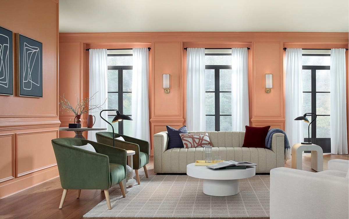
“Our 2024 Color of the Year, Persimmon is a perfect color to refresh your home,” Banbury says. When used in a space like a living room where you spend time with friends and family and entertain, she says this energetic shade promotes conversation and fun. “Layer with soft furnishings and neutrals to layer comfort and to create balance.”
Using the Colors in a Kid’s Bedroom
“Have fun with patterns and shapes to make a kid’s room both playful and comfortable,” Banbury says. “Blues like Waterloo are comfortable and soothing, perfect to create and embrace a restful night’s sleep.” She notes that paint is a perfect way to add a personal touch. “And what better location than the 5th wall, the ceiling – it not only feels one of a kind, but it draws your eyes up embracing the height of the room.”
Using the Colors in a Laundry Room
“What better way to brighten up a forgotten space like the laundry room than an uplifting shade like Friendly Yellow,” Banbury says. “This shade is soft, embracing sunlight to make the room inviting.” She also recommends softening the space with rugs and textured window treatments to create a space that feels comfortable and beautiful.
Using the Colors on a Home’s Exterior
Painting your home’s exterior is one of the best ways to boost your home’s curb appeal. “Traditional meets fun on the exterior of your home with an all over home color like Pearly White,” Banbury says. “Then highlight charming details like columns and window mullions with Cyberspace for a look that is timeless.” She also notes that the front porch has become the extension of the home, and the front door is the perfect place for some personal style and an opportunity to have fun with color. “Select a fun shade like Persimmon for a new take on tradition.”
Using the Colors in a Bathroom
In the bathroom, the Renewed Comfort design swaps out sharp angles for curves. “Traditional gold tones complement tan and white neutrals in quietly colorful contours,” Banbury says.
Using the Colors in a Home Office/Library
Oakmoss is another 2024 Color of the Year in the Renewed Comfort Color Collection. It has a cool undertone and Banbury says it works well as a backdrop color in your home office or library. Then, bring in neutral elements to add contrast.
Using the Colors in a Bedroom
“This year, we’re returning to the theme of the bedroom as a cocoon,” Banbury explains. “Utaupeia is a warm brown that invites you to unwind and relax.” One way to combine this color is with plush, upholstered elements and gently-curved accessories.
Using the Colors to Create an Entertaining Space
If you like dark, moody colors, Dark Auburn is another one of the Renewed Comfort 2024 Colors of the Year. It’s in the purple family and has a warm undertone, creating a rich burgundy look. “Add a cool gray and some punches of color to create a welcoming place for friends and family members to gather,” Banbury says.
Read the full article here


